Communities for a Better Environment
Building Community Power to Achieve Environmental Justice
Communities for a Better Environment (CBE) is an environmental justice organization that empowers low‐income communities of color in California to reduce pollution and promote environmental health through organizing, legal advocacy, scientific and technical support, and leadership training.
My Role
Lead Designer, Wire Media
Team
Marcy Rye, CEO, Wire Media
Ruwantha Weddikkara, Project Manager, Wire Media
Dylan Tuohy, Web Developer, Wire Media
Project Scope
Brand Refresh
UX & Visual Design
Client Type
Environmental Justice Nonprofit
Key Features
(WCAG) Level AA Accessibility
Interactive Community Map
Jump to Section:
Project Overview | Process & Approach | Brand Refresh | Website Design | Impact
From Static to Dynamic: Powering Up CBE’s Digital Presence
Project Overview
The Challenge
CBE’s previous website was outdated and no longer captured the energy of their mission or the vitality of their four communities across California. The site was hard to update, lacked cohesive branding, and failed to effectively engage their diverse audiences, from community members to funders and media.
Project Goals
Refresh the brand identity by modernizing the logo, colors, and typography to reflect CBE’s values of justice, equity, and resilience.
Empower internal teams by building a flexible website they can easily update when needed.
Unify and engage audiences so that community members, donors, and partners feel represented and can quickly take action.
Boost credibility and visibility by positioning CBE as a trusted voice for environmental justice and making a strong case for support.
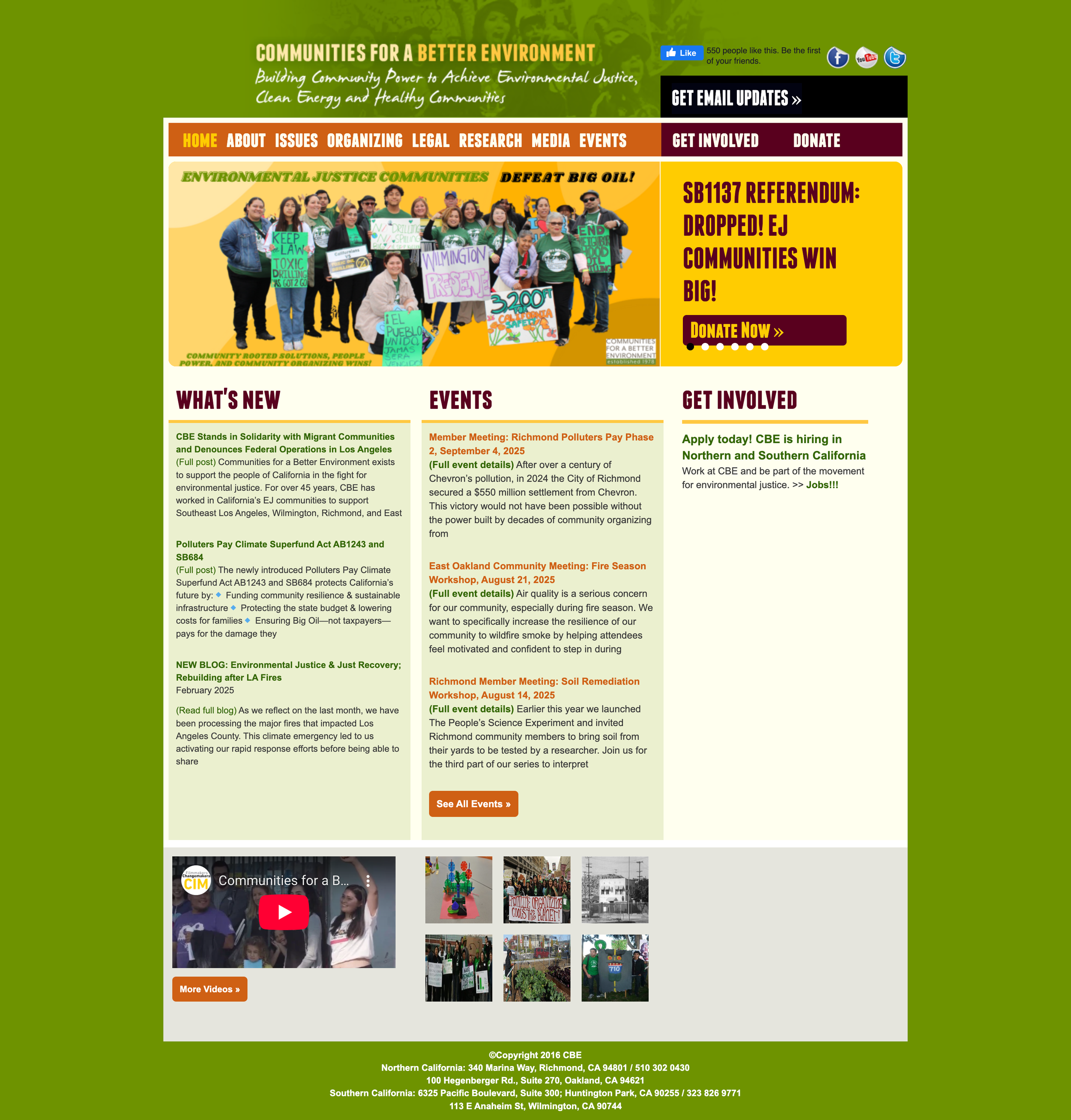
CBE’s previous website was outdated, difficult to update and didn’t reflect their mission and active community.
Process & Approach
Reshaping Identity Through the Design Process
For CBE, I approached this project as a full journey from brand to website, ensuring each phase built upon the last. From clarifying their identity and values through discovery, then building out their visual system to better reflect their mission.
I translated strategy into a user-centered website that prioritized CBE’s four communities, guided visitors to take action, and empowered staff with tools for long-term management.
Throughout the process, collaboration with the CBE team was critical, allowing me to refine designs through user feedback and quality assurance.
-
I began by gathering insights through meetings with the CBE team and distributing detailed questionnaires to their teams to collect feedback.
This process guided us through the visual refresh that aligned with CBE’s mission, values, and the diverse communities they serve.
The responses also clarified their organizational culture, audience priorities, and long-term goals, laying a strong foundation for not only the refreshed brand, but the website redesign as well.
-
I modernized CBE’s logo, typography, and color palette through an iterative process of exploration and feedback. The final brand guide equipped their team with a cohesive system to apply consistently across digital and print platforms.
-
This phase focused on strategy, where I facilitated the process of building a site priorities matrix to determine which features were most essential to include.
I also created a detailed site map that centered CBE’s four communities and initiatives, while guiding visitors toward key actions like donating, getting involved, and supporting the organization’s work.
-
With priorities and site map in place, I moved into the wireframing and interface design to bring the strategy to life.
The comps prioritized CBE’s four communities and initiatives while creating clear pathways for users to take action.
High-fidelity designs ensured the site was both visually engaging and fully accessible across devices, translating CBE’s refreshed identity into a seamless digital experience.
-
During build-out, I partnered with the developer to maintain accuracy in design and functionality while also actively involving the CBE team in quality assurance.
Together, we tested user flows, forms, identified and resolved bugs, and performed accessibility checks to ensure the site was WCAG-compliant, consistent in content, and easy for staff to manage long term.
Polishing the Brand, Powering the Movement
Brand Refresh
Building on the brand discovery insights from CBE leaders and partners, I guided CBE through an iterative design process that included the following:
Typography: Ubuntu Bold for strong headlines and Source Sans Pro for body text, balancing authority with approachability.
Color Palette: Greens, gold, rust, and overall earthy tones to create a grounded, but modern and accessible design that reflects environmental justice and community resilience.
After providing a couple options for typography and color palettes, I narrowed them down based on team feedback to ensure alignment with goal. From there, I created a refined wordmark options in black and white, followed by color applications.
The outcome was a modern, cohesive visual identity supported by a brand guide with a logo lockup, color palette, and font selections. This equipped CBE with the tools to maintain consistency across digital and print platforms.

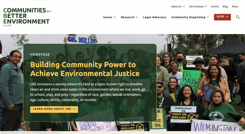
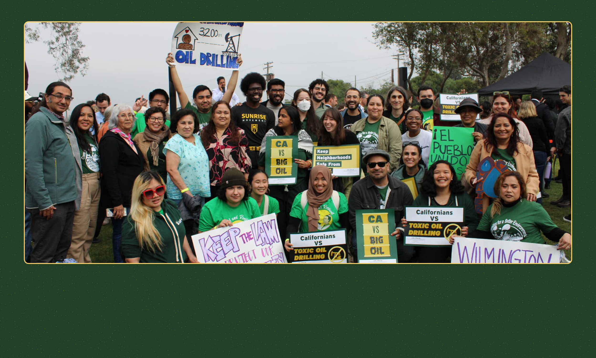
Rebranded site for Communities for a Better Environment
Website Design
Bringing the Brand to Life Online
Every aspect of the design, from color, typography, and layout, was guided by the new brand direction, ensuring the website felt modern while staying true to CBE’s values and mission.
The brand system was carried through buttons, cards, maps, and calls to action, creating a cohesive experience that remains consistent across both digital and print platforms.
The team and I focused on implementing features that would make the site more interactive, accessible, and action-oriented. Each feature below was designed to spotlight CBE’s organizing work, connect visitors to their local communities, and make it easier for supporters to stay informed and get involved.
Priority Features
-
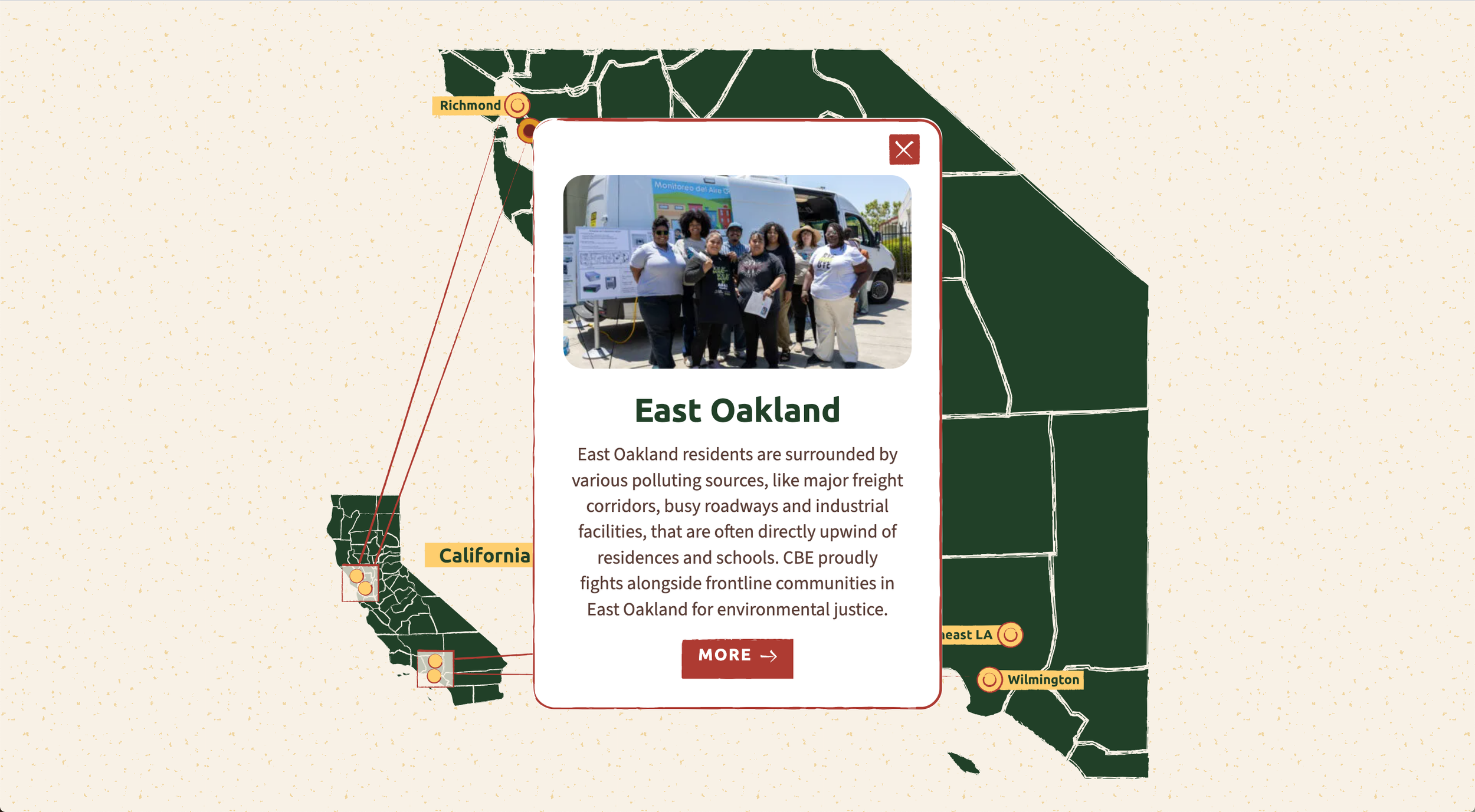
Interactive Community Map
The map allows visitors to quickly explore CBE’s four communities, connect with the work happening in each, and making it easier for local community members, volunteers, supporters, and media to get involved.
-
Social Media Integration
This feature connects the website directly to CBE’s regional social media channels, making it easy for community members to find and follow their local updates. It also supports CBE’s teams by increasing visibility for events, urgent calls to action and amplifying social media presence overall.

-
Latest News & Events Block
Tackled the common frustration that project content was “buried” or outdated; creates an intuitive and visually engaging way for visitors to explore current and past projects, with clear calls to action for involvement.


Impact
The redesigned brand and website gave Communities for a Better Environment a modern, cohesive platform that truly reflects their mission and communities. By modernizing the look and feel, improving accessibility, and highlighting key features, the site now empowers staff to manage content with ease and reduces reliance on external support.
Visitors can more easily connect with CBE’s four communities, stay informed about initiatives, and take meaningful action. Ultimately, the project amplified CBE’s voice in the fight for environmental justice and strengthened their ability to mobilize supporters statewide.