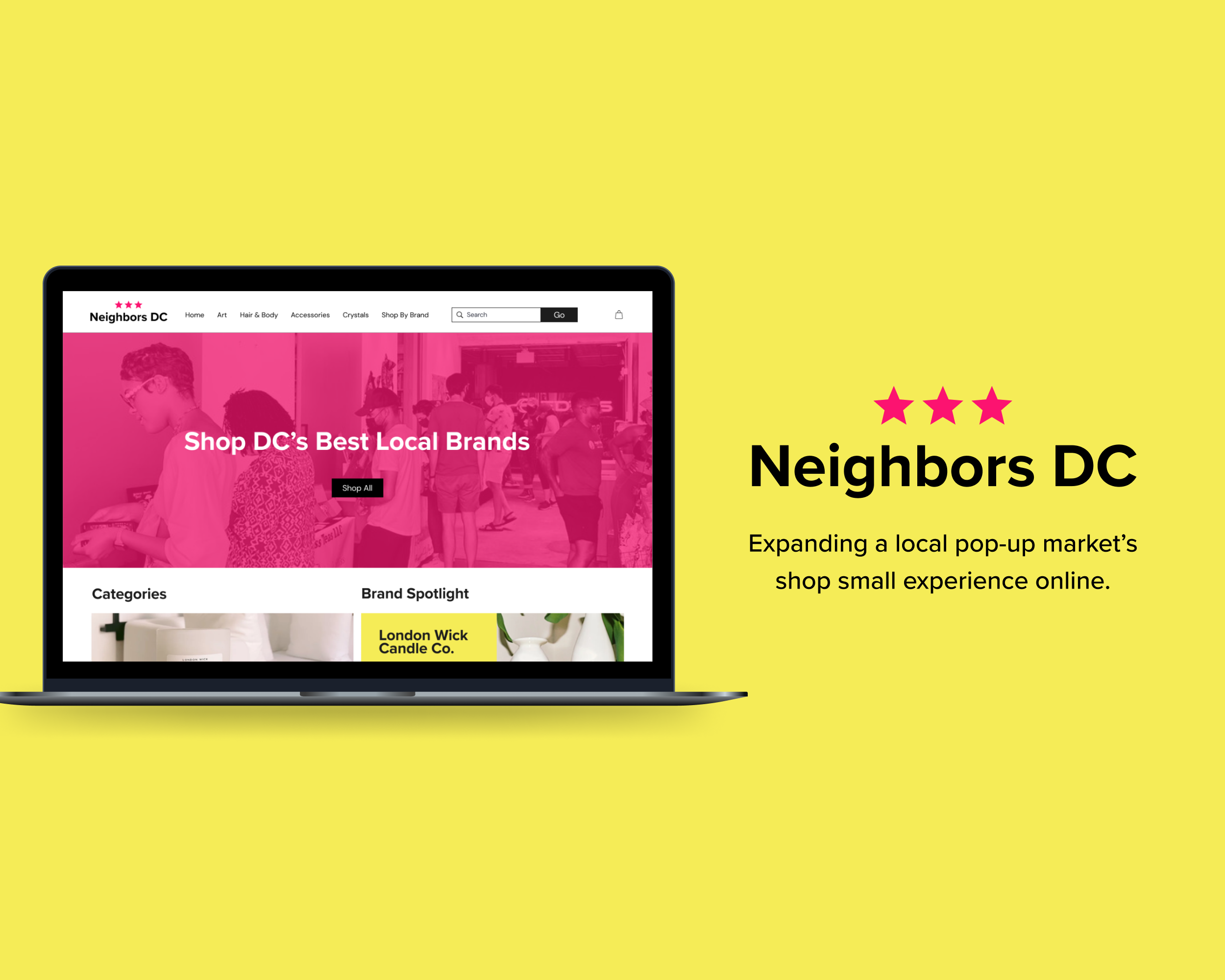
Overview
Neighbors DC is a community rooted pop-up and creative hive for small, local and independent brands in Washington, DC, Maryland and Virginia. Their mission is to share space, network and promote local businesses, all while offering opportunities for brands to thrive and grow. They value being an immersive shop small experience offering a variety of home, art, beauty and lifestyle products from local makers.
Category:
E-commerce, Desktop Website, Small Business
Timeline:
March - April 2022
Team:
Tarine Wright, UX Researcher & Designer
Platform:
Desktop
Tools:
Figma, Maze Testing, Optimal Sort, Ipad
The Challenge
Neighbors DC has grown rapidly in the past year, with 6,000+ customers coming in across DC, Maryland, Virginia and beyond to visit every weekend. Currently, their website does not support online shopping for its growing roster of vendors. When customers are not able to visit in person, they still want a way to find and purchase their favorite lifestyle products from Neighbors DC online. The business would also like to expand its reach, expose its vendors to a larger customer base and offer an online experience that reflects the warm and diverse community of its in-person markets.
The Solution
To build a desktop e-commerce website for customers that reflects Neighbors DC's in-person markets while allowing them to easily search and discover products from brands. Additionally, I wanted to ensure that product photos and reviews give customers a sense of confidence in their purchase.
The Process

User Research
Meet customers where they are.
To start, I knew that the best way to approach building an e-commerce website for Neighbors DC meant that I would have to meet customers where they are. In this stage, my goal was to gather people who frequently shop for handcrafted and lifestyle products with small, local businesses online to understand what their motivations, needs and frustrations were. I conducted 5 user interviews with people between the ages of ages 25-45.
I also wanted to know if they had any personal experience shopping at local markets in order to understand how I could translate the in-person market experience into an online store.
“If I’m going to spend money on a product…I want to support the people in my local community. There are amazing artists here.”
— Sonia, Interviewee
Key Insights
The common theme among users.
After talking to people with a variety of experiences, I was able to discover a wealth of information about how they shop, why and what may frustrated them in the experience.
Through the process of affinity mapping, I was able to discover these main user needs:
40% of people are motivated to buy unique products through small businesses
80% of people use search & filters as the most prominent way to discover products
80% said that high quality product images are important
80% consider product reviews crucial in determining quality and satisfaction of product
Affinity Map
Stakeholder Insight
What does success look like for Neighbors DC?
I also had the opportunity to sit down with Enica Barnes, the owner and event organizer of Neighbors DC to get more insight into the business’s brand, target audience and goals.
Here’s some of Enica’s top priorities when it comes to scaling Neighbors DC:

Grow community of vendors & customers by 2x

Increase each vendor’s revenue by $4,000/week

Provide more opportunity for collaboration between vendors
User + Business Goals
A Win-Win.
From my interviews, I uncovered that both customers and NDC value a sense of connection to small businesses as well as being able to discover new brands. This discovery was critical to help inform my design decisions later on.
“We want to create this [reality] of a truly diverse community…where vendors feel welcomed and customers have access to these amazing goods.”
— Enica Barnes, Owner, Neighbors DC
Competitive + Feature Analysis
Taking a closer look at what’s already out there.
To support the insights from my interviews, I conducted a competitive analysis on three other e-commerce shops focused on lifestyle products and who hosted multiple brands on their site. I also performed a broader feature analysis on direct and indirect competitors to see any trends of specific functions being used.
This was critical to assess the overall strengths and weaknesses of similar stores to understand where Neighbors DC had the opportunity to stand out. It also helped to note any conventions across the e-commerce space that I could incorporate in the site design.
Across the three shops, product photos & curated product collections were the strongest while information architecture and layout needed improvement.
The most common feature among these sites were product filters while reward programs were not nearly as prevalent.
User Persona
Meet our star customer.
From the above research, I identified a user persona who represents one of Neighbors DC’s core customers. Now that I was able to put a face to my insights, I made sure to center Kennedy in my design decisions moving forward.
How might we…
Create an online store that helps Kennedy shop her favorite lifestyle products from market vendors?
Create an online shopping experience that allows Kennedy to feel a personal connection to Neighbors DC?
Create an online experience that reflects the NDC’s current in-person markets?
Ensure that Kennedy feels confident about the quality of products they’re purchasing?
Feature Prioritization
What’s important For Kennedy right now?

Search Bar
Having a reliable search feature is crucial for Kennedy’s shopping experience as it’s the main way she finds what she needs – especially amongst a sea of different brands.

Product Search Filters
To further assist Kennedy on her product search, it is important that she’s able to filter down her search by price to stay within her budget.

Product Ratings
Quality is everything to Kennedy. Being able to skim reviews for what’s hot and what’s not, ensures her of money well spent.
User flow
I created a user flow to understand how our persona Kennedy would move through the NDC website to find the products she’s looking for using the key features identified earlier.
In this task, Kennedy is on the hunt for a skin oil, but wants to make sure its of quality and right for her needs.
Site Map
Through an open card sort with 8 participants, they identified 5 main categories as well as subcategories that informed the information architecture of the website.
Ideation
Low-fidelity Sketches
After I nailed down my information architecture, I started to explore the possibilities of what the site could look like.
Mid-fidelity wireframes
Next, I went on to build out my mid-fi wireframes which gave further structure and definition to the website.
Mood board
Look & Feel
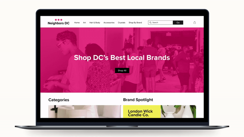
For the overall branding, I used NDC’s Instagram and current brand colors as inspiration to intentionally style the site. Using bold colors, their lively market images and clean, san serif type gave the site a more friendly & lively feel,. This also reinforces the energy of their in-person markets and that approachable feel Kennedy and other customers are looking for.
Design
High Fidelity Wireframes
My final wireframes brought all of the pieces together so that I could get it out into the world to test and see if there were any missing pieces that needed to be addressed.
Final Prototype
User Testing
Testing, Testing.
Now it was time to test the website and see if it was able to successfully meet Kennedy’s needs. I used the high-fidelity prototype to test a total of 5 people who have similar online shopping experience and interests as Kennedy to get the most accurate feedback. These test took place in a moderated setting via Zoom. The goals for the test were as follows:
Users will be able to search for a product
Filter their results based on their needs
Find & read reviews for quality assurance
I had each participant complete the tasks of:
Show how they would locate a body oil on the website
Show how they would pinpoint a body oil specifically for dry skin
Show how they ensure the quality of an item
Testing Insights
Yay or Nay?
As participants completed each task, I asked them to talk about their decisions, delights and frustrations out loud. By doing this, I was able to get a better sense of what was working and what was not.


LIKES
4 out of 5 participants preferred the visual categories on the homepage
Easy navigation throughout site
Overall clean layout
UI elements reflect brand personality
DISLIKES
Back button instead of clicking on logo to access home page
4 out of 5 participants felt like the sub category images were an extra step
2 out of 5 thought the category “beauty” was not an intuitive place to look for a body oil
“Going through the website was pretty easy, though when I think of a body oil, I don’t often go to the ‘beauty’ section.”
— Jib, Tester
“Since it is my first time on the site, I was a little confused by the ‘recent searches’.”
— Marc, Tester
“I tend to look at images before I look at text which can change my experience of the site.…I wanted to click on the ‘beauty’ image before going to the navigation.
— Darnell, Tester
Iterate
Priority Revisions
Based on tester feedback, I identified some change I could make right away in the website prototype. Some of these changes emphasized clear language and UX writing that would allow users to feel more confident in their interaction with the site.

Next Steps
What I Learned
Overall, I really enjoyed going through the process of building Neighbors DC e-commerce website. As I continue to improve the site, I would love to test the effectiveness of the recent iterations to see how it impacts user’s experience.
One of my biggest lessons was learning to balance the needs of customers and the business. I was lucky that NDC’s goals and visions aligned closely with their target customers. I understand that that is not always the case, so moving forward I think it will be important for me to find creative solutions with my team on how to center both needs.
Some challenges that I came across, particularly in my initial user interviews, is that a lot of customers also mentioned their frustrations with the check out and shipping process. For shipping specifically, I understand the limitations UX can have in this area, but as I continue to iterate on the website I want to focus on the checkout experience and how to make customers feel more comfortable with shipping times and policies within our realm of tools.
In the future, I would also like to focus on brand discoverability and building that sense of connection between vendors and customers through the website. For this, I wold like to collaborate with a marketing team on the best strategies to go about that. Since this was the first launch of the Neighbors DC online store, it was important for me to focus on the most important features that customers would need to have a good experience shopping on the site.
Lastly, though this was a solo project, I think I would greatly benefit from working within team, such as other UX designers, researchers and engineers to gain different perspectives about how to approach building the website.
NDC Featured Vendors:
A Contemporary Market | Blue Moon Aquarius | Drawn By Dara | London Wick Candle Co. | Venus & Sol Crystals
Market Photos By:
Neighbors DC