Humanities Action Lab
Collective Storytelling for Collective Action
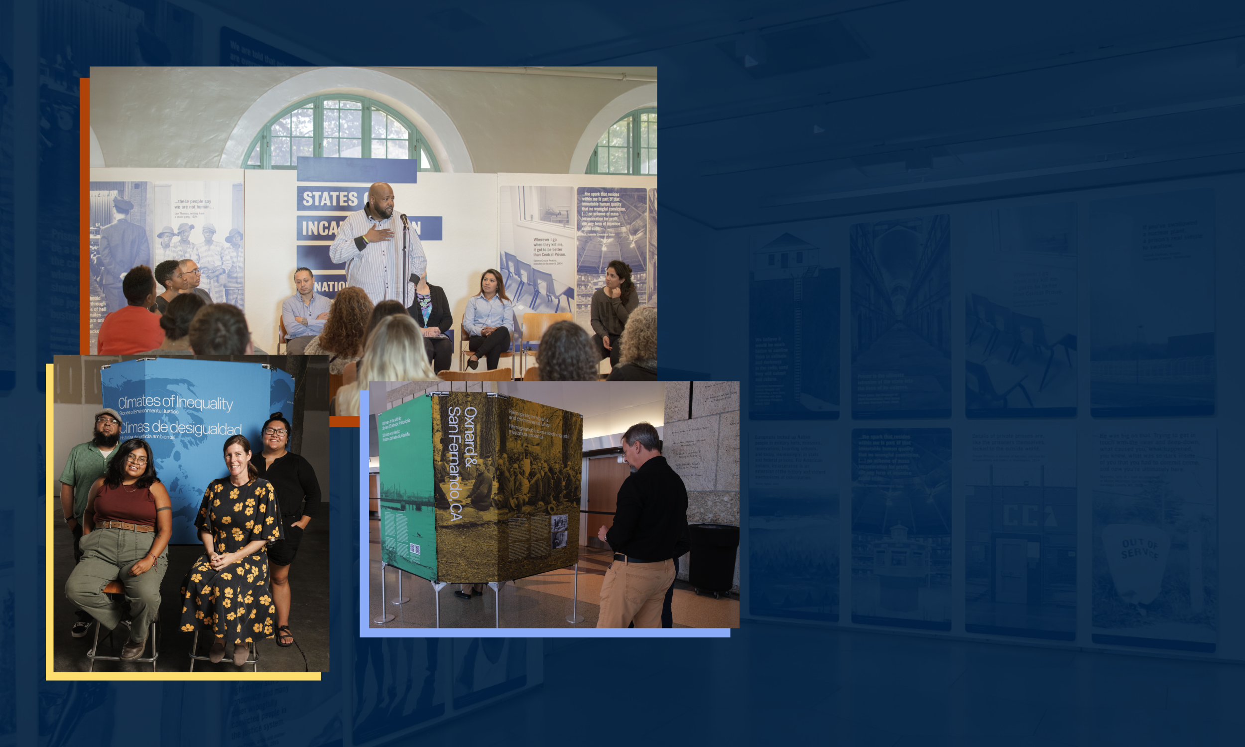
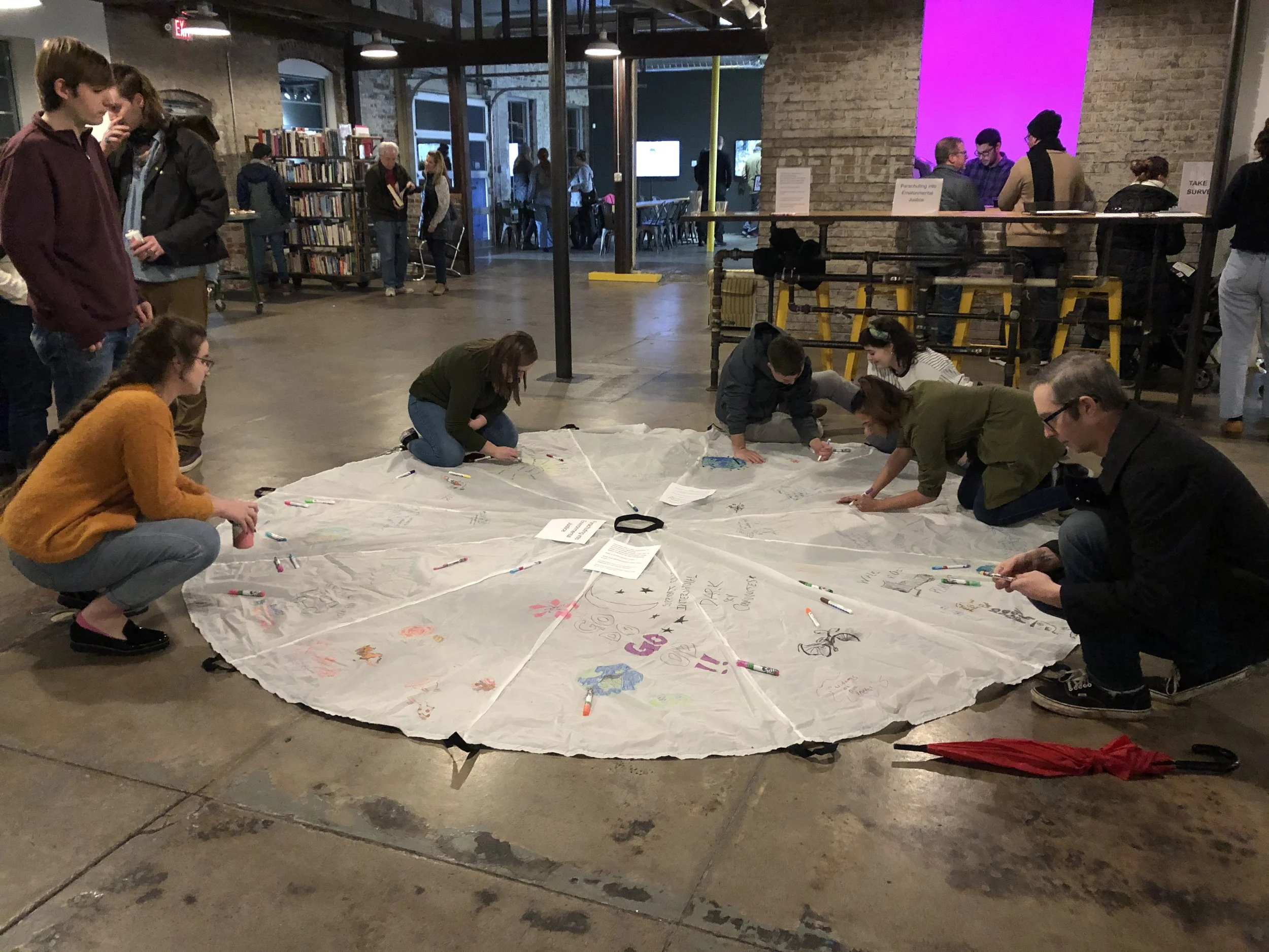
Humanities Action Lab (HAL) is made up of 1,000+ community leaders, students, and educators in 40+ cities, and growing, connecting local histories into collective public memory projects.
HAL aims to use shared historical experience to guide collective action for a more just future.
My Role
Lead Designer, Wire Media
Team
Marcy Rye, CEO, Wire Media
Ruwantha Weddikkara, Project Manager, Wire Media
Dylan Tuohy, Web Developer, Wire Media
Project Scope
Branding
UX/UI Design
Client Type
University-hosted Civic Initiative Coalition
Key Features
(WCAG) Level AA Accessibility
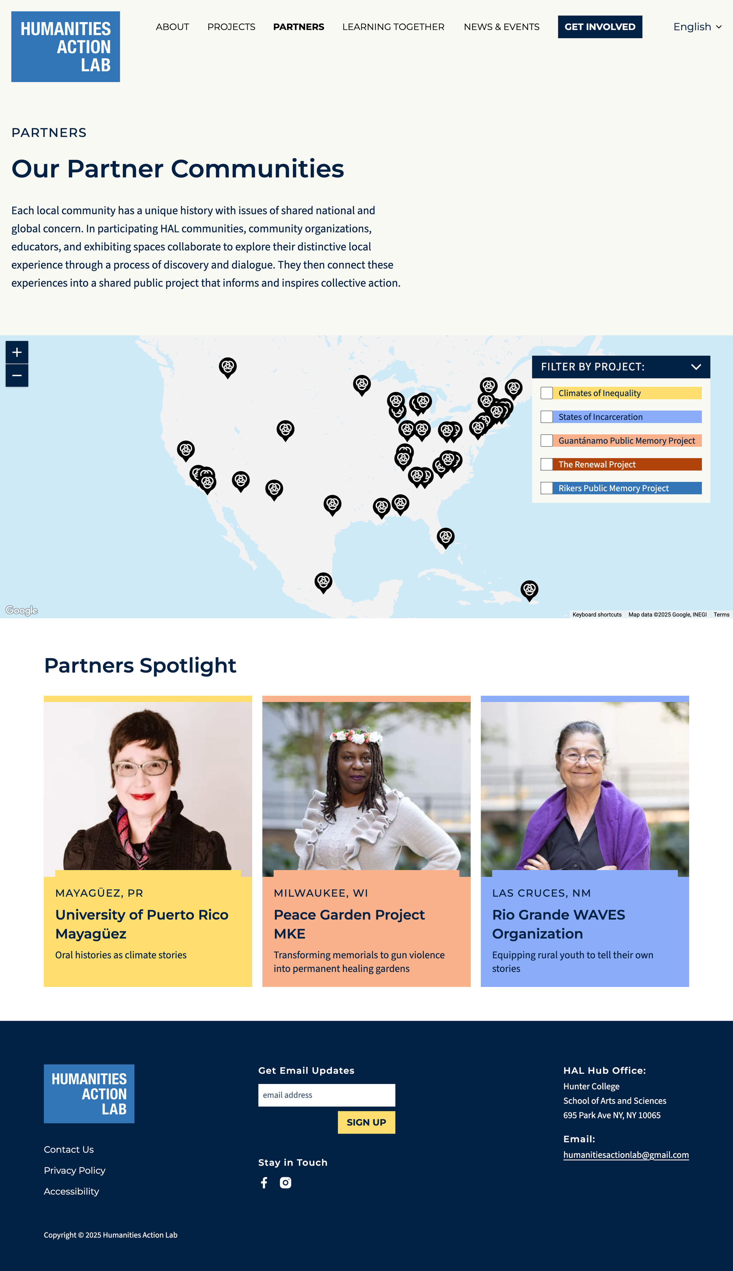
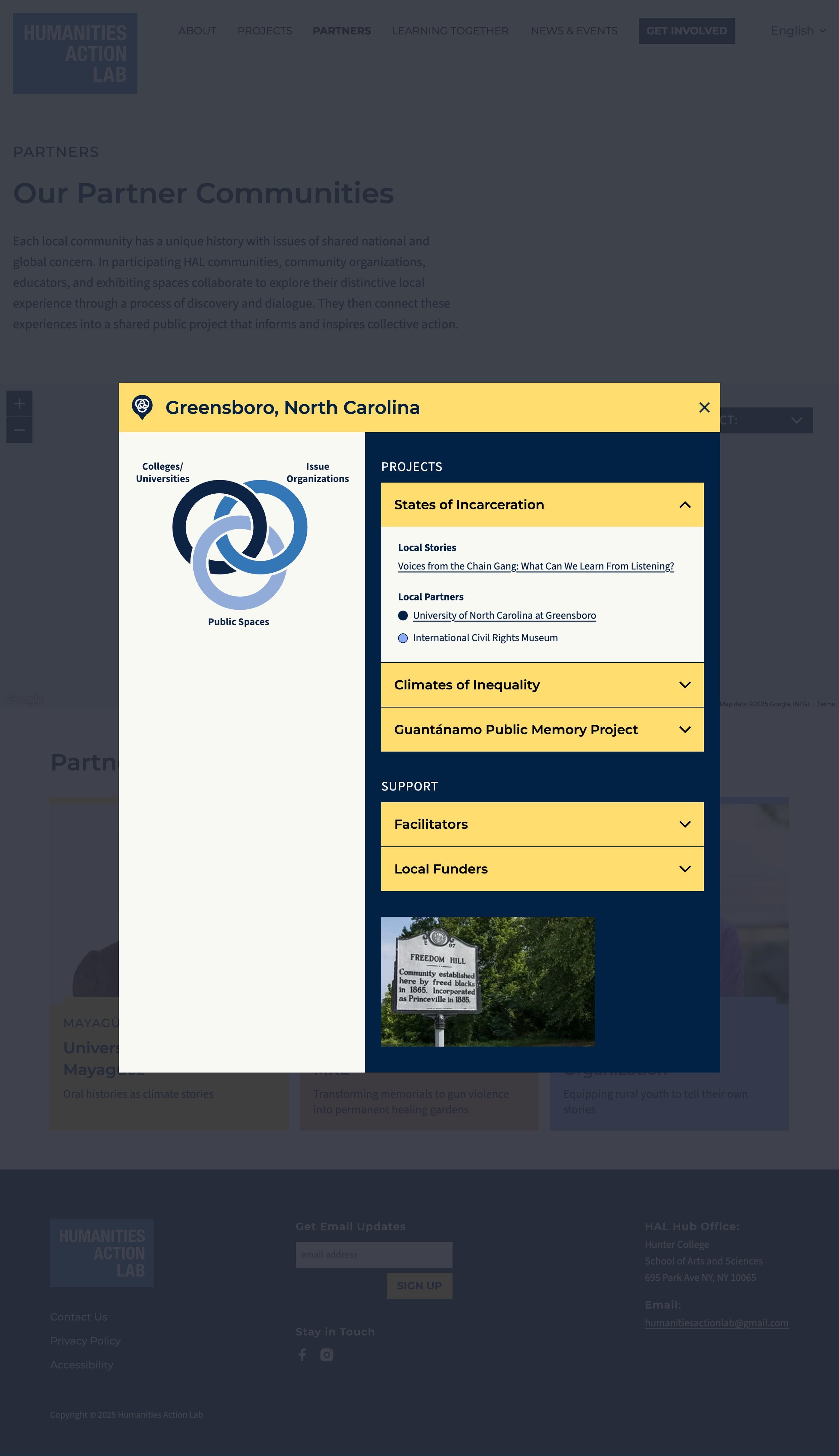
Partner Map
Interactive Diagram
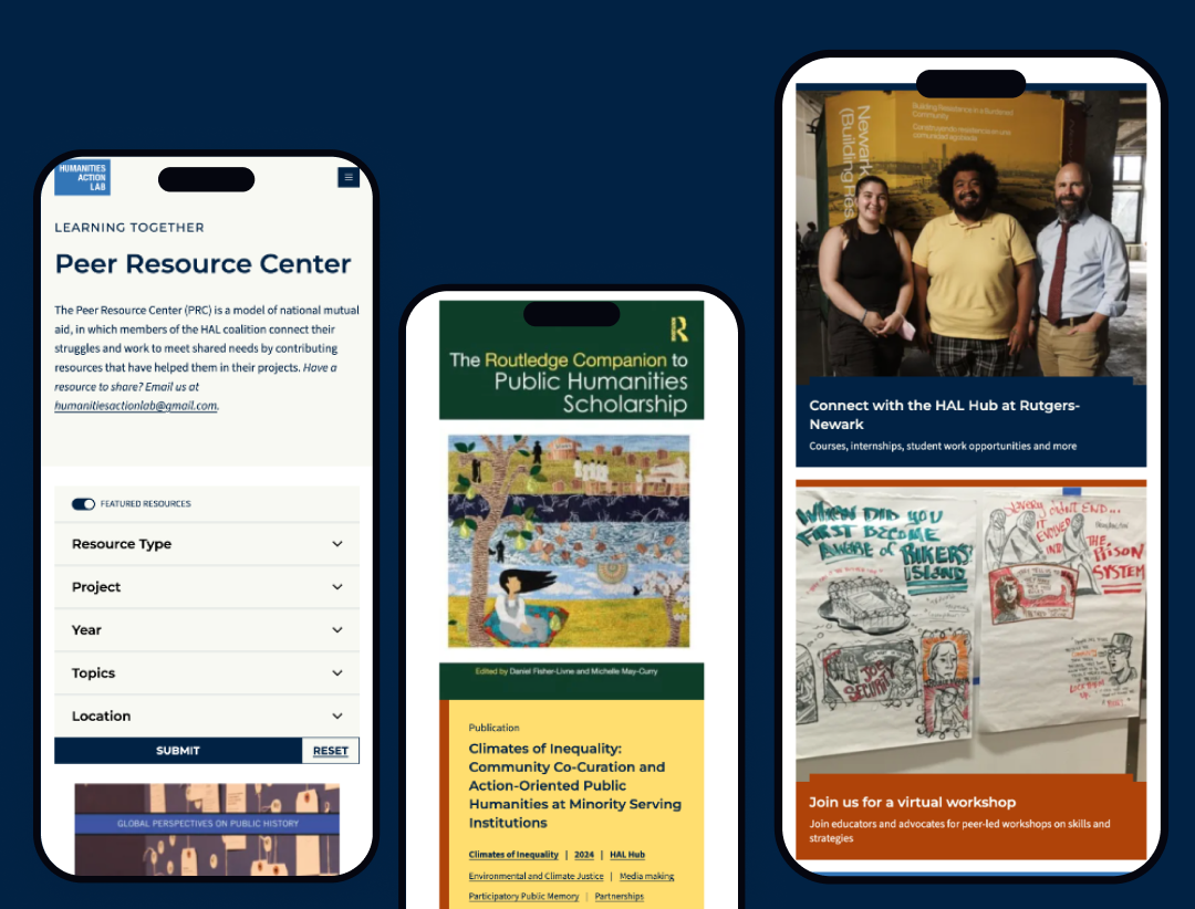
Resource Library
Jump to Section:
Project Goals | Process & Approach | Key Insights | Design | Results
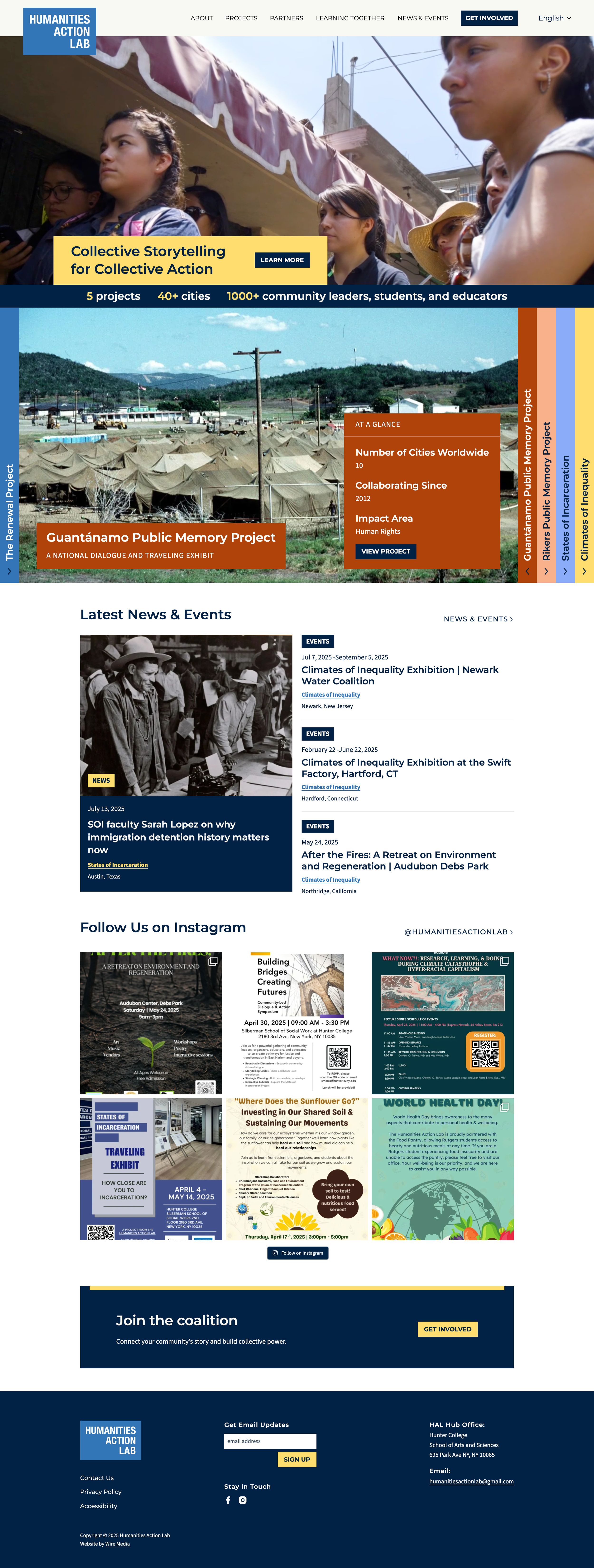
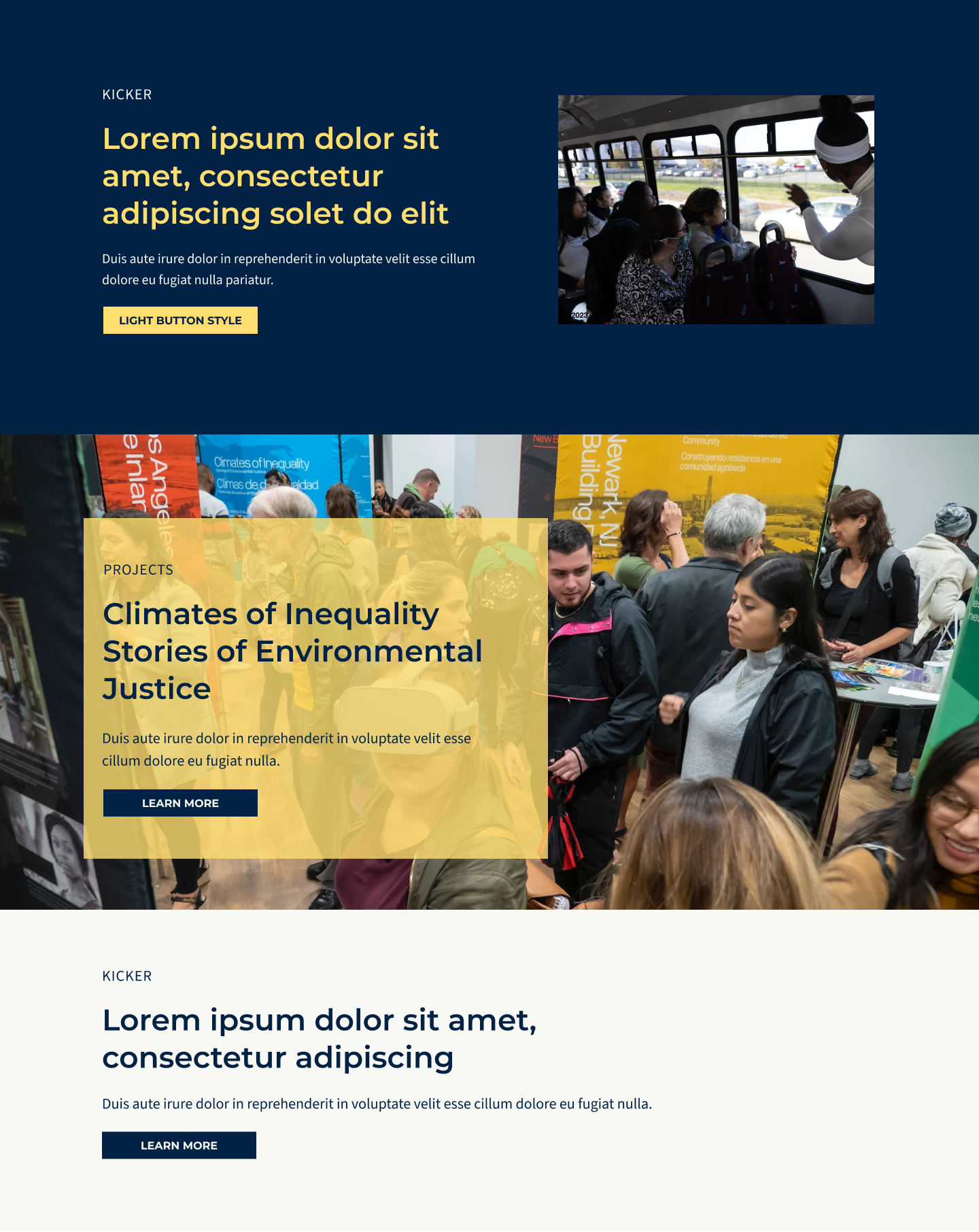
Connecting Public Projects Through a Shared Vision
Project Goals
Position HAL’s website as a central hub that connects and contextualizes its many partner-led public projects under a unified framework and shared methodology.
Clearly explain how HAL functions, how partners collaborate across communities and universities, and how new institutions can get involved, while also showcasing the coalition’s breadth, values, and theory of change.
Visually, the redesign aimed to refresh the aesthetic, highlight existing media, introduce dynamic content, and create a more engaging way to feature HAL’s partners and impact.

Process & Approach
Guided by Strategy, Grounded in Partnership
The Wire Media team and I followed a collaborative, phased approach to redesign the HAL website. We started with discovery and strategy, moving through UX and visual design, and concluding with quality assurance and user testing.
Each step helped ensure the new site met audience and client needs, reflected HAL’s mission, and delivered a cohesive, accessible experience.
-
In the discovery phase, we worked closely with the HAL team to build a shared foundation for the redesign.
This included a comprehensive questionnaire, stakeholder interviews, and a collaborative review of brand materials, content needs, and organizational goals.
We gathered insights into HAL’s structure as a coalition, its values and mission, and the diverse audiences the site needed to serve, ranging from university and community partners to potential collaborators and the public.
This research informed a detailed creative brief that served as a north star throughout the project, shaping the site's structure, tone, and visual approach.
-
To ensure the new website reflected the voices and needs of its coalition partners, we conducted a detailed survey with HAL staff and partners.
The survey gathered both qualitative and quantitative insights on how users engage with the current site, what content and features best support their work, and how they want their organizations represented.
This participatory approach helped shape the site’s structure, features, and visual design in a way that centers partner voices and real-world use.
-
Our approach to content strategy began with a thorough audit of the client’s existing sitemap, followed by collaborative refinement to better align the structure of the website with user needs and organizational goals.
We then provided a prioritized features matrix to help the HAL team assess which custom elements would be most impactful and within budget to include.
With this foundation in place, we translated the updated sitemap and feature priorities into wireframes, establishing a clear content hierarchy, user flow, and functional layout to guide both visual design and development.
-
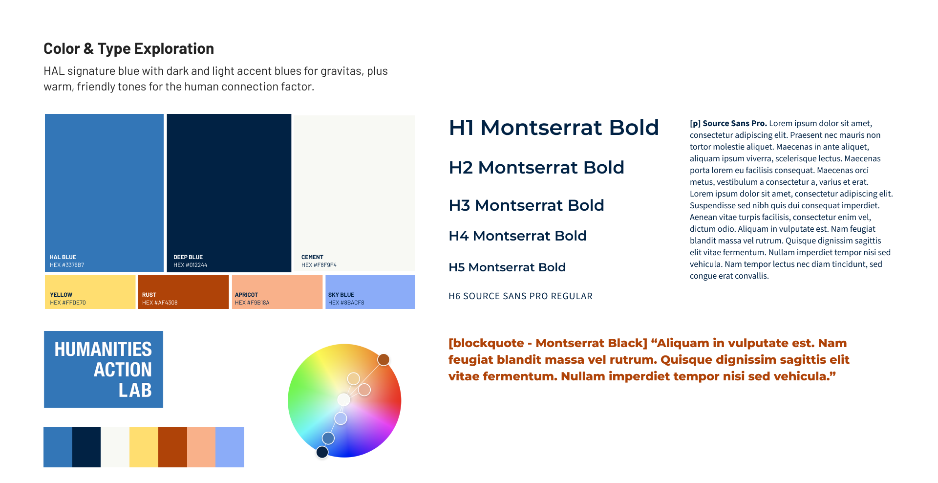
Within the website redesign scope included a light branding refresh, as the client came to us with minimal brand assets.
Through an iterative style tile process, we explored updated typography, color palettes, and visual treatments that could better reflect HAL’s coalition-based, community-driven work.
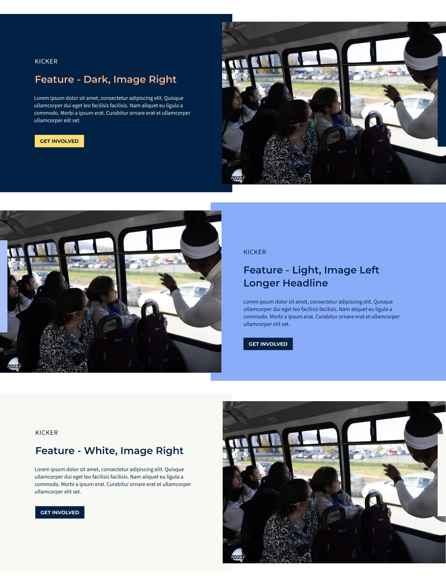
Once a direction was approved, we applied the refreshed visual language across pixel-perfect comps for key pages, such as the homepage and project pages to establish a foundation, then moving efficiently through the rest of the site.
The result of the site included a flexible, modern visual system that supports HAL’s evolving identity while remaining accessible and mission-aligned.
-
Before launch, we conducted a thorough QA process to ensure the site functioned smoothly across devices and browsers.
We provided the HAL team with a user testing guide to support internal review, gathered feedback on usability and performance, and implemented any necessary design updates or bug fixes.
This final phase helped confirm the site was stable, accessible, and aligned with project goals.
Designing for shared perspectives
From our stakeholder survey, it was emphasized that partners wanted the site to better showcase the scope of the HAL network, provide practical resources, and make the coalition’s methodology easier to understand.
Here’s what we discovered:
-
Partners emphasized the site’s value for teaching and project visibility, but flagged outdated and buried content.
100% of respondents reported using the site to share projects, curricula, or activism examples with students and community members.
-
Stakeholders wanted the site to balance internal coalition needs (partners connecting with each other) and external visibility (public awareness and new collaborations).
Current partners were ranked as the top priority by 82% of respondents.
Activists and the general public were ranked at 64% and also seen as key audiences.
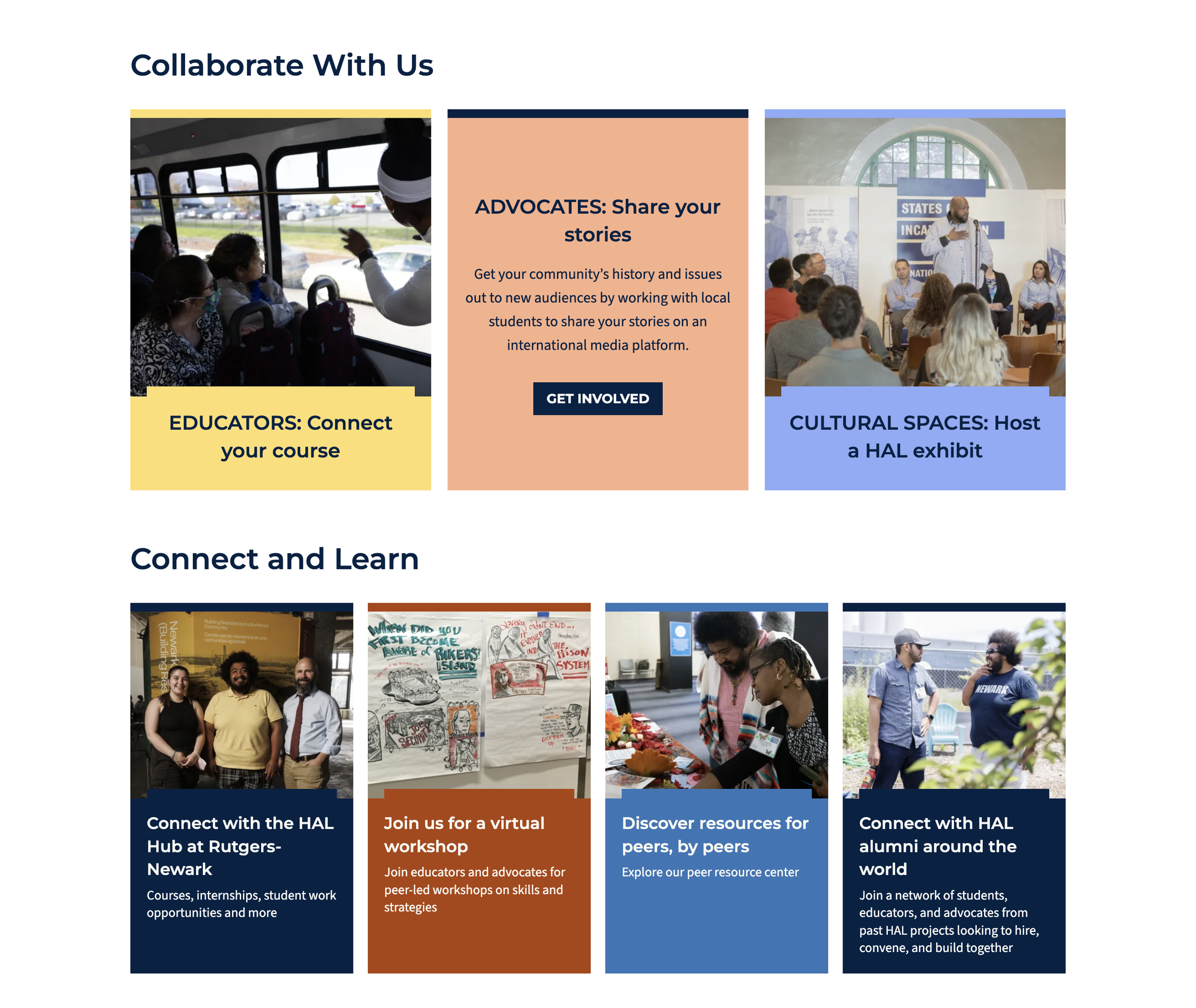
-
Visitors should be guided from exploration into action.
46% of respondents wanted users to get involved with the organization or local project.
27% wanted users to visit their organization’s website.
9% wanted user to contact HAL directly.
-
Stakeholders clearly prioritized specific tools within our provided custom features matrix.
82% selected a Resource Center.
73% selected a Partner Map.
64% each selected News and Projects pages as most useful additions.
-
100% of respondents used words like “inspired,” “empowered,” “curious,” or “included” to describe how they want people to feel when visiting the site.
Key Insights
Priority Features
-
Interactive Partner Map
A visual way to showcase HAL’s breadth, highlight local projects, and provide credibility through visibility of the full coalition.

-
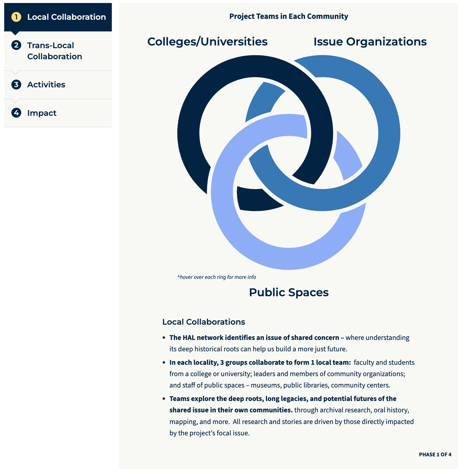
Interactive Diagram of HAL’s Model
Addressed stakeholder feedback that HAL’s values, accountability, and methods were not clearly communicated on the current site. Also provides a clear, engaging way to explain how partners collaborate translocally across public spaces, issue organizations and universities.

-
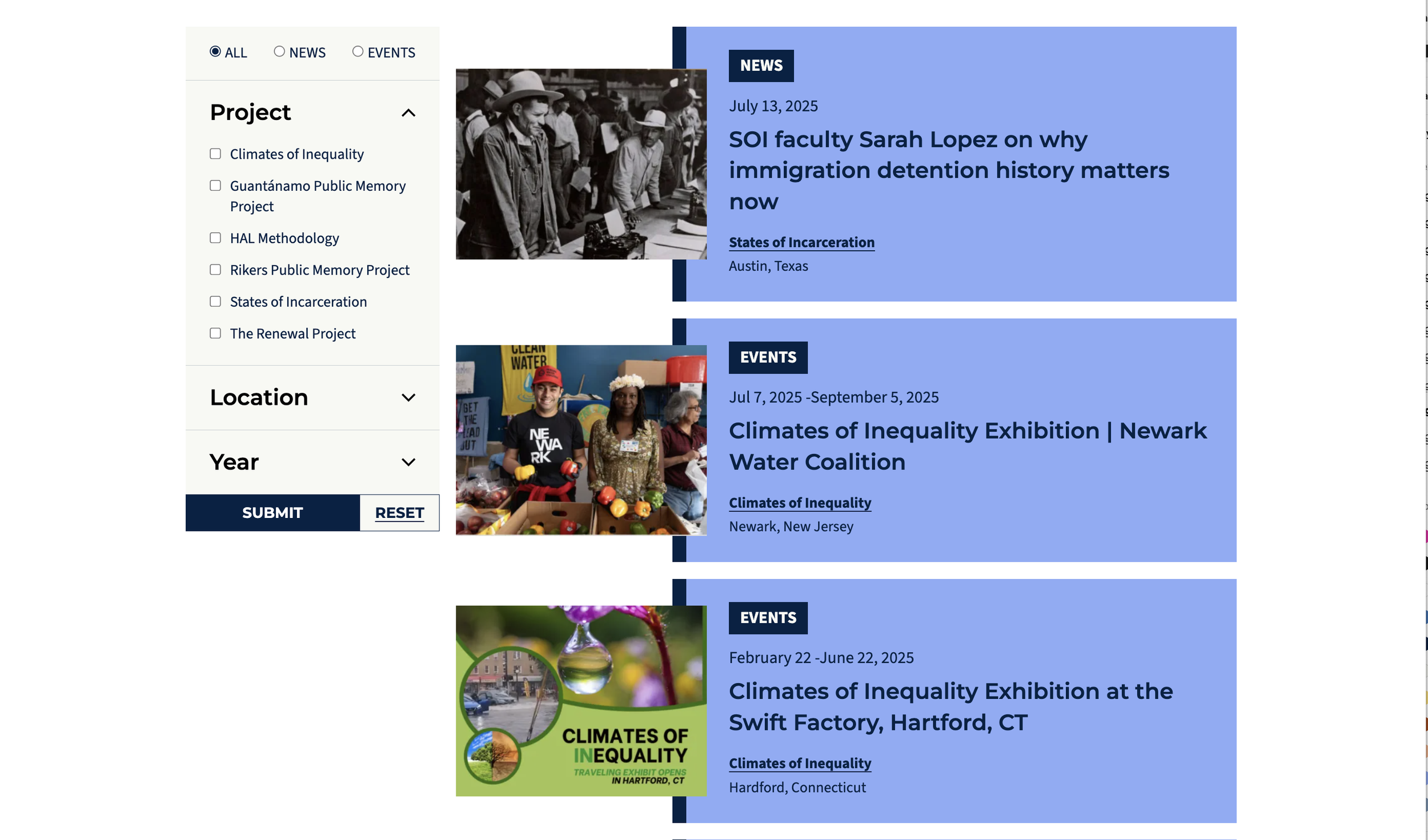
Projects Overview Slider
Tackled the common frustration that project content was “buried” or outdated; creates an intuitive and visually engaging way for visitors to explore current and past projects, with clear calls to action for involvement.

-
Resource Center
Giving partners, students, and activists access to methodologies, how-to guides, and shared learning to support on-the-ground work.

“Displaying our partnerships builds trust with our community and potential partners. It helps us with funding to show our network of affiliations and clarifies our place in the HAL ecosystem.”
— Current HAL Partner
Light Lift, Big Impact
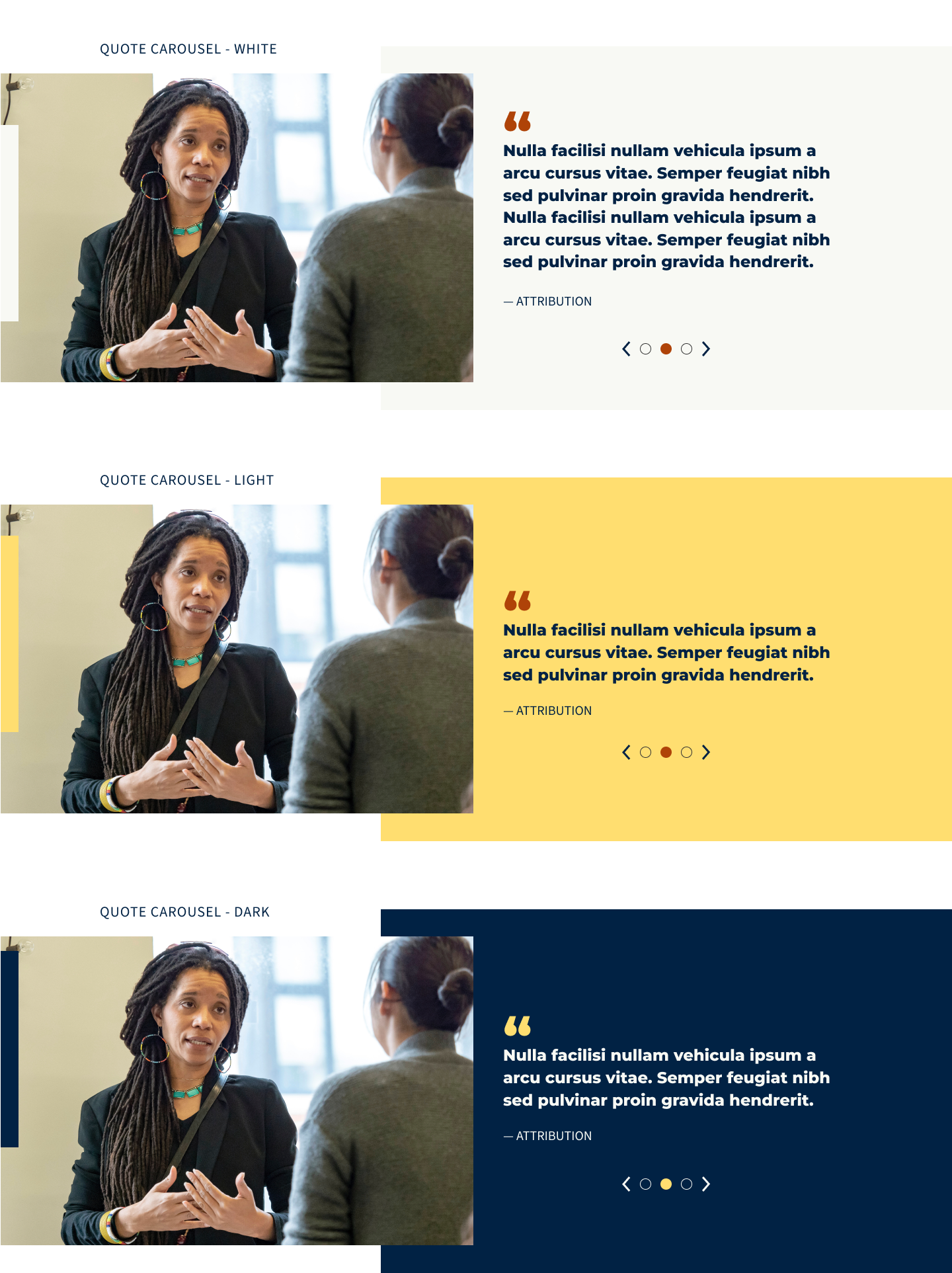
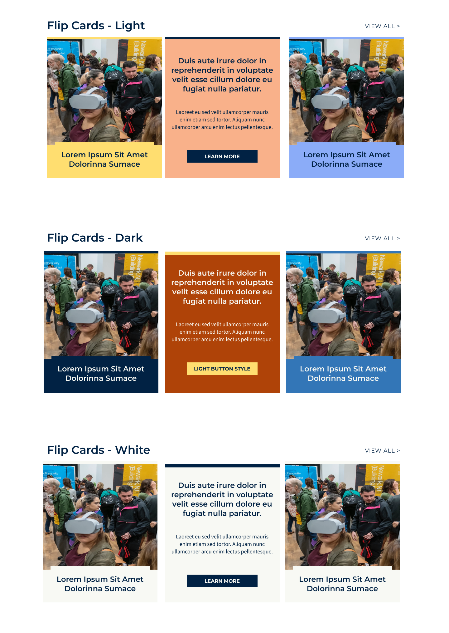
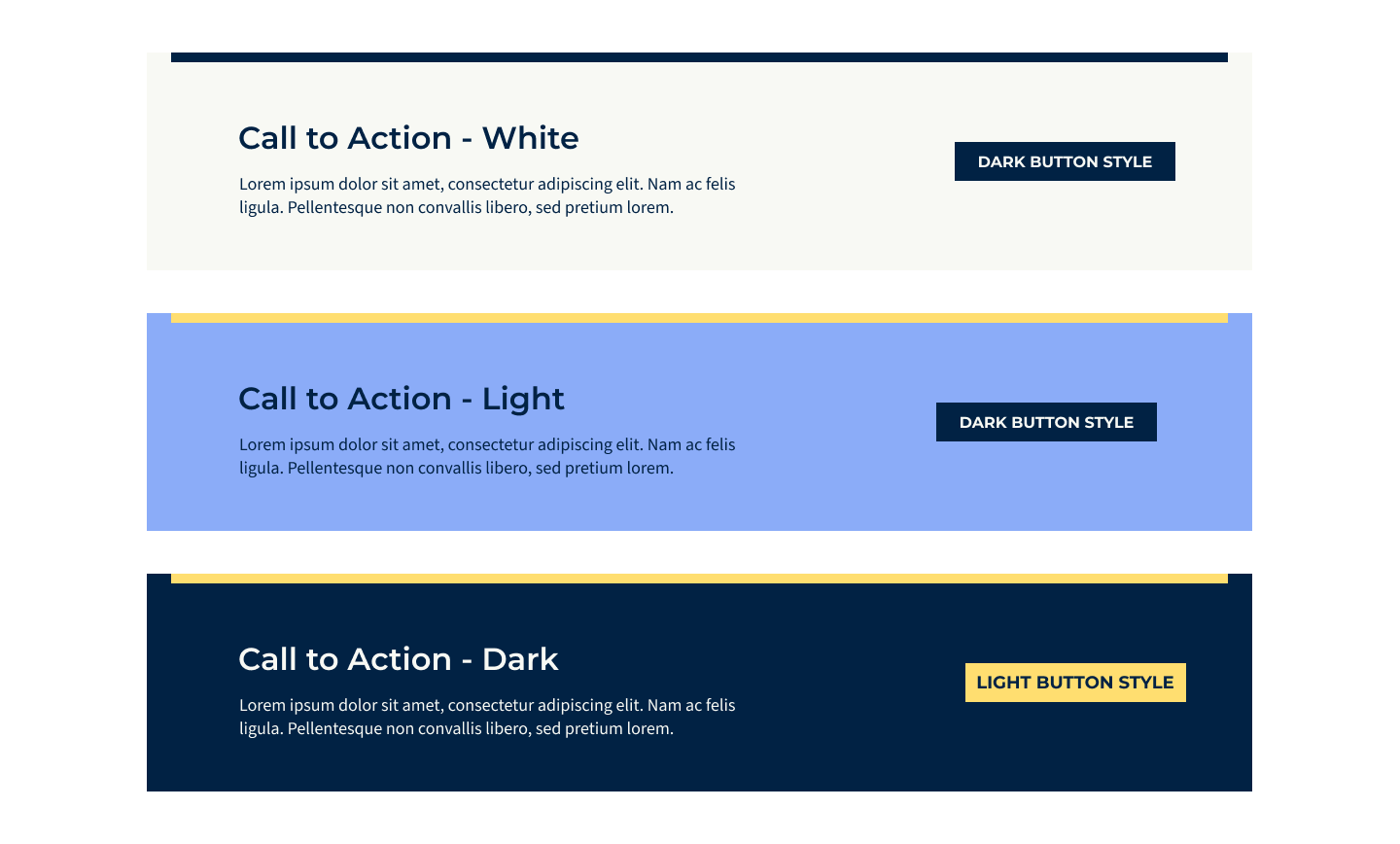
Branding & Visual Design
To design a cohesive and engaging new site, we needed to create a visual system that could both honor their academic roots and reflect their community-centered, coalition-driven mission.
We began with a light branding refresh, guided by an iterative style tile process. By working collaboratively, we ensured that the evolving brand direction aligned with HAL’s values of community, collaboration, and storytelling.
The final result is a flexible, modern visual system that:
Supports HAL’s evolving identity across projects and collaborations
Creates a recognizable but adaptable aesthetic that can grow with the organization
Prioritizes accessibility and clarity for diverse audiences
Remains mission-aligned, visually expressing HAL’s values of equity, collaboration, and collective storytelling
This light brand refresh elevated HAL from a fragmented visual presence to a cohesive identity that better represents the breadth and energy of its coalition.

Before & After Rebrand
Results
-
Clarity & Context
Transformed a limited, minimal site into a platform that clearly explains HAL’s complex, coalition-based projects.
-
Polished Branding
Established a cohesive, modern visual identity that elevates credibility and trust.
-
Project & Partner Visibility
Introduced interactive maps, diagram and dedicated project pages that highlight each initiative’s focus and impact.